Killary

I took some photos along the roadside near Killary with a view to using them for some new paintings. I took these because certain elements attracted me – colours, the shape of the mountains in silhouette and the shape of the cut bog. I like this one below because of the warmth of the orange grasses against the blue sky – feels more like Australia than Connemara.


Hill near Killary


The light is still very low and it illuminates each blade of grass much like theatre lights. There is great drama too in the starkness of the mountains – they loom in the distance, great shadowy figures waiting in the wings.

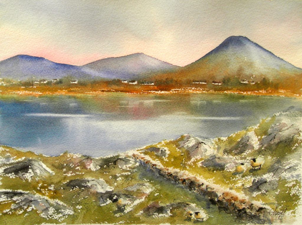
This is a protected area so there are few signs of human interference save the ubiquitous telegraph poles and the road itself. You feel like you are standing in a bowl or an amphitheatre with mountains on almost all sides. I love the blue pool in this one below – it reflects the colour of the sky.


Killary


I have started a series of new landscapes based on these images which I will post about soon.

Contrast

I started this one with a couple of others recently. It’s loosely based on some pictures I took out on the bog road this month. I think this one is all about contrast – between the black bog and the white/golden grasses, the darkness of the earth itself and the lightness and blueness of the sky and its reflections.

Here’s how it started below.


First stage of January Bog


Here’s how it progressed – I worked this whole piece very wet, playing with the inks and paint and trying to work with their fluid qualities. I love the way they react together, bleeding into each other like glazes fusing in a kiln.


Second stage of January Bog


I’m almost tempted to leave it as it is ( above ) but I go back to it once the colours have dried. I try to put in just a bit more detail and to describe the grasses a bit better and give them more direction..


Finished Landscape - January Bog


While I am quite happy with this one, I almost prefer it at the earlier first stage as pictured above – what do you think?


Return to Painting

It’s always hard to get back to painting after a break. I’ve had a couple of false starts since Christmas but I have resolved to try to develop the work in a number of ways. I want to make some larger work this year for one and I also want to make my painting looser, less busy, and more expressive somehow. Yes, quite the tall order I have for myself indeed. This will all take time and it’s frustrating to begin with clear ideas like these in mind and then to find that it’s not so easy to translate into something actual straight away. It’s a process of course and it will take time.

So, here’s how my first painting for 2013 began – it’s really more of a sketch because it’s on quite a lightweight paper.  It’s similar to some bog paintings I made at the end of last year although this was not my intention exactly. I used an easel for the initial part of the painting in an effort to keep the composition loose and energetic.


First stage of painting


Now for some more paint..


Second stage of painting


I’m still using the easel at this next stage but I’m finding that the ink is dripping vertically ( of course! ) which is not necessarily where I want it to go.


Third stage of painting


I finish it on the table and I darken the whole piece with more brown and blue. I discover about now that if I use any more paint or ink the page will dissolve in front of me so this is my main reason for stopping!  I’m reasonably satisfied with it at this stage in any case – my problem with it is that it does seem a bit of a muddle in terms of composition. I like the colours and the diagonal thrust of it but it did seem to work better earlier on. What’s your view?  I think I’ve more work to do..


Fourth stage of painting


Winter Waits

Cashel by Marianne Chayet

The first week of November has come and gone with more dry days than wet. It’s a remarkable thing here in Connemara where the rain is never far away. We feel grateful when we get a whole day of dry weather, even more grateful when we get two in a row. I find an excuse to go outdoors when it’s like this, everything else can wait; housekeeping, book keeping, laundry, shopping, even painting is put on hold. If I’m really organised I’ll put some washing out to dry first thing, so that I can leave guilt free.

I took these photos out on the bog road between Clifden and Roundstone. October’s gold has deepened to these Wintry hues, it’s brown all over and under – russety, chocolatey, chestnut brown. The light is low, shining across rather than above and making the brighter grasses glint like shards of coloured glass or metal.


Brown Bog at Roundstone


The water makes a silvery stripe against the bog and there’s an inky blackness at the edges where the grasses are reflected. It makes me think of a pool of mercury sliding through the landscape.


Photo taken at Roundstone Bog


There’s a stark kind of drama about it all, a bareness from the flat grey light of the sky that seems to muffle colour like sound. I like to track down the words, sometimes a verse to match the way the land looks. That’s how I stumbled across these lines from the poem ‘November‘ by John Payne.  I think they fit the mood well – the setting is an empty stage and there’s more than a hint of darkness in the shadowy figure of Winter, laying in wait.


The tale of wake is told; the stage is bare,

The curtain falls upon the ended play;

November’s fogs arise, to hide away

The withered wrack of that which was so fair. 

Summer is gone to be with things that were.

The sun is fallen from his ancient sway;

The night primaeval trenches on the day:

Without, the Winter waits upon the stair.


taken from ‘November‘ by John Payne ( 1842 – 1916 )

Night Bog

I found this painting (below) in a drawer of old works. It’s very small, about 4″ x 3″ and I’d started it about two years ago for a group exhibition. I was unhappy with it at the time and decided to put it away. Sometimes these discarded paintings don’t seem so bad later on so when I came across this one recently, I thought I might rework it a little. The white patch in the middle ground is a damaged area where something stuck to it and then the paint was removed. While I like the colours in the piece, I think it lacks definition.


Found painting by Deborah Watkins


This is the finished piece below. I’ve given the sky more interest and direction using some white paint and a little charcoal. I’ve also added a fine wash of gold and blue. I tidied up the white patch with some brown ink and then I put some gold grasses in the foreground. I’ve pushed the grasses diagonally across the bottom of the image to give a sense of atmosphere. Finally I added some tiny gold highlights in the middle ground where the light of the moon might be catching the tips of the lighter bog grasses.


Finished painting by Deborah Watkins


Bog Furrow


I’ve been working on this one for about a week. It hasn’t come together as easily as the last couple of paintings, I’m not sure why. Perhaps my enthusiasm has waned a little since the first and I need to change direction for a while. Here’s how it started below.


This is the next stage. This large furrow is the main interest and I’ve added a grey pool to draw the eye down and in to the painting. I’ve tried to vary the colour and texture of the grasses but I think this middle ground looks confused. I also think that the brown line following the direction of the hill downwards has the effect of slicing the picture in two..


Penultimate stage of bog painting


Here’s the painting as I have left it below.  I’ve developed the background a bit by adding some colour and definition to the sky and the mountains. I’ve tried to make the grasses interesting by varying the blocks of colour on either side of the furrow. I’ve also softened the brown line so that it doesn’t break up the composition as much. The direction of the grasses pushes against the direction of the hill, hopefully to give a stronger sense of movement. I’m still a bit unsure about this one – I can see the struggle in it and I wonder if this is obvious to the viewer. Let me know what you think.


Finished Bog painting by Deborah Watkins


Finishing

I often find returning to a painting more difficult than starting out. When I begin something, I usually have a fairly clear idea about what I want to do and there is a sense of urgency in getting that down. When I return to a painting, it is different because now there is something there and while there is a desire to keep going, there is also a certain anxiety not to mess it up. The danger is to tread too cautiously and drain the life out of the piece with tentative brush strokes and lack of experiment. Since these two pieces were near completion when I left them last, this fate was less likely although perhaps that is ultimately for you the viewer to decide..

This is the first painting as I left it below. You can compare it with the finished version underneath. I’ve added more detail to the grasses in the middle ground using a combination of green and red inks and a bristle brush. I’ve also tidied up the mountains in the background and darkened the left foreground with more green ink. Finally, I mirrored the white grasses on the right of the brown furrow with a broad stroke of white and gold paint.


Bog painting as I left it


Finished bog painting


Here’s the second painting I worked on with it’s finished version beneath.


Golden Bog by Deborah Watkins


Finished Bog Painting


I’ve changed this one quite a bit so hopefully it hasn’t lost too much of the clarity that it had.

I decided to darken the mountain in the background to make it recede more and I’ve added lots of colour and texture to the grasses in the foreground. I wanted to bring some green back in to the piece and I also wanted to define the cut bog so I straightened some of the dark brown lines. Finally, I added a wash of ink to the sky to give it a little more depth. I’m calling it finished. What do you think?

Water, Snow and Ice

I’m reading a book that most of the world has read and enjoyed but which I am just discovering. It is ‘Tinkers‘ the novel by Paul Harding that won the Pulitzer prize in 2010. It is simply the most beautiful thing I’ve read in a long time and I am savouring every page. I decided that I would try to make some paintings to describe one lovely passage.

This part of the book describes the failure efforts of the protagonist’s salesman father to sell small pieces of jewelry to peasant women on his travels. The land is frozen and the women are too caught up in their own hardships to allow themselves this small pleasure.


‘He thought, Buy the pendant, sneak it into your hand from the folds of your dress and let the low light of the fire lap it late at night as you wait for the roof to give out or your will to snap and the ice to be too thick to chop through with the ax as you stand in your husband’s boots on the frozen lake at midnight, the dry hack of the blade on ice so tiny under the wheeling and frozen stars, the soundproof lid of heaven, that your husband would never stir from his sleep in the cabin across the ice, would never hear and come running, half-frozen, in only his union suit, to save you from chopping a hole in the ice and sliding in to it as if it were a blue vein, sliding down in to the black, silty bottom of the lake, where you would see nothing, would perhaps feel only the stir of some somnolent fish in the murk as the plunge of you in your wool dress and the big boots disturbed it from its sluggish winter dreams of ancient seas. Maybe you would not even feel that, as you struggled in clothes that felt like cooling tar, and as you slowed, calmed, even, and opened your eyes and looked for a pulse of silver, an imbrication of scales, and as you closed your eyes again and felt their lids turn to slippery, ichthyic skin, the blood behind them suddenly cold, and as you found yourself not caring, wanting, finally, to rest, finally wanting nothing more than the sudden, new, simple hum threading between your eyes’.

 taken from ‘Tinkers’ by Paul Harding, Chapter 1, pages 24/25 


This is how I started the painting below.


First stage of painting


The largest part of the painting is under water. I wanted to have a central shape plunging downwards and water gushing back upwards and in to the air. This is the next stage below.


Second stage of painting


I used lots of colour for the plunging shape – pinks, golds, browns, some red. I made several attempts to get this sense of movement using large brushes and lots of colour – blues first and then splashes of white for the water. It’s coming together here but I’m not happy with the top part. It doesn’t feel like a cold place yet. The next image below is the piece as I have left it.


Finished painting by Deborah Watkins


I used a broad brush, some white paint and some charcoal to work up the sky and I’ve darkened the water at the base of the painting. Now I think it feels like snow and the depths feel like murk. I’ll let the paint dry before I decide whether to add any more to it. What do you think?

Paul Henry

I’ve been looking at some of Paul Henry’s landscapes recently and thought I might write about them here.

Henry was an Irish artist who was known especially for his West of Ireland landscapes. He was born in Belfast in 1887 and he studied art in Paris before his return to Ireland where he lived and worked on Achill Island (1910-1919) off the Mayo coast for many years. While in Paris, Henry was greatly impressed by the modern avant-garde movement of the time and the bold colourful works of Cezanne, Van Gogh and Gaugain. Landscape painting was no longer just about realism but about colour and energy and the individual mark of the artist’s hand. I love this quote by S.B. Kennedy in his book on Paul Henry where he describes these new ideas of the time:

“Cezanne and Van Gogh saw clearly because they had cast aside all the theories and prejudices of the Schools and were looking at nature as if for the first time, and above all seeing it with emotion.”

This notion of seeing landscape with emotion really resonates with me because it seems to me that this is what painting is all about. I imagine then how Henry must have taken these new ideals and applied them to our own peculiar landscape and weather conditions, without the heat and intensity of the mediterranean sun. He recognised the singular beauty of the landscape and the light in the West of Ireland and he learned to articulate this using his own palette of muted colours. The painting above is called ‘Errigal County Donegal’ (c.1930 Image taken from imma.ie ) and it demonstrates this very well. The setting seems to shimmer in a kaleidoscope of greys tinged with blue and pink against the golds and browns at the base of the painting.

This next image below is an earlier work (c.1922-23) called “The Bog at Evening’. I love the simplicity of this composition –  mountain, horizon line, turf and water. I admire the contrast that he has set up between the shadowy dark browns of the turf and purple mountain and the delicate pinks and pastels in the billowing cloud shapes. The reflections of the clouds in the bog water and the low evening light give the painting a perfect stillness where only the evidence of human activity now remains.


Image taken from D7ET website 


This next painting is called ‘West of Ireland Cottages’. Once more, the atmosphere dominates this piece, the vastness of the sky and mountains over the small settlement of cottages. The strong blues of the mountains sing against the yellow of the thatch and gold of the bog, a perfect example of how complementary colours can be used together with great effect.


Painting by Paul Henry

 Image taken from  Christies.com


This last painting (below) is called Bog Road. It uses similar colours but the tones are more subdued in the top two thirds of the canvas. The lightness of the sky contrasts strongly with the dark stacks of turf. The middle ground is highlighted with a streak of gold where the sun drops down between the clouds and sits beautifully against these ribbons of blue that he uses to describe the receding hills.


Bog Road by Paul Henry

 Image taken from Mayotoday.ie 


Perhaps the most impressive aspect of Paul Henry’s work for me is it’s apparent simplicity. Many of his greatest paintings seem at first glance to be composed of a simple arrangement of shapes and colours. It is the degree of complexity and subtlety within these seemingly simple choices of colour, tone, shape and gesture that make them so exceptional in my opinion. As a painter, I have so much to learn from these paintings!

What do you think about them? Do you think that they are relevant to day or have anything to do with modern Ireland?


Bog Cotton Painting II

I’ve just finished working on this one. I’ve been tinkering with it for several days and at times painting is like this for me. Other paintings I can finish in one or two sittings. It’s hard for me to say which method works better but generally I think that there is more energy in the work that is finished quickly. This is how this painting began (below).


Landscape sketch by Deborah Watkins


Here it is with more colour. These two stages were carried out during the same sitting.


Second stage of landscape painting by Deborah Watkins


I returned to the piece after a few days and added lots more detail. I’ve gone a little overboard with the blue ink here and it’s quite fluid so I have to wait until it dries before I continue.


Third stage of landscape painting


This is the next stage (below). I’ve attempted to ‘tighten’ it up but I think that it has become confused. I’m definitely trying too hard here and it’s not working!


Fourth stage of landscape painting


When I return to the painting, I try to de-clutter the image by redefining the strip of bog in the centre and I use more green in the foreground (below).


Finished Painting by Deborah Watkins


This is the painting as I have left it (below). I’ve softened some of the lines in the middle ground and I’ve used some red ink to add more contrast. I am happier with it now because I think that it has more of the atmosphere of the place. I’m reluctant to take it any further at this stage so I’ll leave it for a few days before I varnish it…what do you think?


Finished painting by Deborah Watkins