Lecknavarna

This is the second painting in a recent series based on the Lecknavarna townland near Killary. Here’s how the painting began – it’s a 12″ x 16″ canvas board.

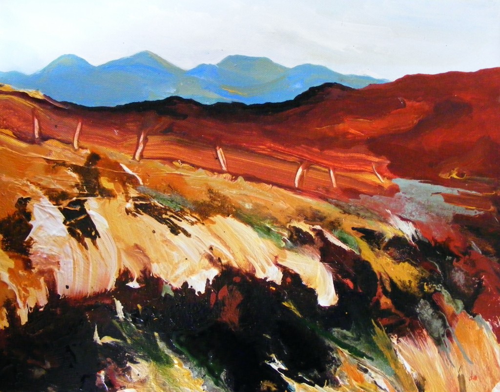
Blue and red dominate and these are the colours that stood out when I was there. The fiery red is unusual for this time of the year and the effect was accentuated by the low fall of light. The mountains ( the Ben Coonas ) complement with rich tones of blue. I’ve accentuated the depth of hue in this initial sketch and I make a mental note to do some more studies like this soon as there is an immediacy and an energy to the piece at this stage that would work on a smaller scale.


First stage of blue road painting


Here’s the next stage. I’ve used some dark ink on the mountains and I’ve added more detail to the road and middle ground.


Second stage, blue road painting


I work with paint and ink together at this next stage and add some green to the foreground to give it more definintion.


Third stage blue road painting


The mountains have become a little too dark and flat so I attempt to lighten them next.

Next stage, blue road painting


This continues below and at last I feel that the mountains are coming alive. I referred back to the initial sketch to help me achieve this. The paint is still wet when I take this photo.


next stage, blue road painting


This is the same stage but the paint has dried and dulled a little. Once again, this will deepen once the piece is varnished.


Blue Road - finished painting


Return to Painting 2014


I got back to painting this month once the kids returned to school. Armed with some photos taken near Killary, I chose two largish canvas boards ( 12″ x 16″ ) and one stretched canvas ( 12″ x 14″ ) to get started. I have been working on all three paintings over the last few weeks, bringing each of them along in stages. I took photos at the end of each painting session which proved useful as I was able to use the earlier images in some cases to develop the work at a later stage. I have written about each piece separately due to the number of photos – here’s how the first piece began below. I love this initial phase of getting the fresh paint onto the board, there’s a great freedom and an opportunity to be bold with broad sweeps of colour.


Painting first stage


This is the next stage – I’ve used a good deal more paint, working from the top down. I’m happy with the blue mountains and don’t develop these much further.


Painting second stage


The middle ground is next, probably the brightest part of this piece. I’m using ink and allowing it to bleed into the paint in places.


Painting stage 3


Next I start to work on the foreground – it still lacks definition. I want to get across the effect of looking into or through the earth by abstracting this part of the painting so I experiment with some different shapes.


Painting stage 4


I try a few bold upward sweeps using a large brush and some gold and white – I also use inks ( blues and reds ) through the paint. I decide to leave it at this stage.


Painting stage 5


The paint is dry in this final photo. The colours have dulled a little but these will be lifted again once the piece has been varnished.


Last stage Connemara Loop Painting

November Landscapes

Cover image – ‘November Pool’ by Deborah Watkins


These landscapes were worked together. They are all done on 5″ x 7″ heavyweight acrylic paper. The one above is based on a view of the Twelve Bens mountain range from the Roundstone Bog Road. I’ve kept the mountains sketchy and light to make them recede a little and I’ve used lots of thick paint and ink in the foreground to describe the grasses and this large pool. I didn’t take photographs during the process  – they were worked quickly and sometimes I find that stopping to take images interrupts the session too much.

I’ve called this one below ‘November Red’ – the colour of the bog has been exaggerated but the contrast between the paleness of the grasses and the peat itself is there.


November Red by Deborah Watkins

‘November Red’ by Deborah Watkins


This next painting was also worked quickly – I’ve used large brushes for the foreground and smaller ones to describe the hills behind. It’s evening so the colours are all quite dark. I’ve attempted to heighten the drama with this dark cloud shape that mirrors the swirling lines of the bog.


November Landscape by Deborah Watkins

‘November Evening’ by Deborah Watkins


A little too much colour for November? Perhaps, but is is all fading now and quickly so maybe I’m just taking stock..


Black bog, blue hills

I’ve been working on some small paintings this week ( 5″ x 7″ ) – I really enjoy painting on this scale as I can get results quickly. It’s not just the speed factor though ( impatient as I am ) it’s the ability to make a better response to the landscape. At the moment I find this more difficult with larger work – covering the canvas takes longer so the response is less immediate. I believe that smaller works and drawings often have an energy about them that is lost in larger work. I would love to scale up in the future and get better at making bigger paintings – a bigger space, bigger brushes, more paint – it’s good to think about the possibilities. For now small is good for me.

The composition here is based on a favourite spot of mine near Oughterard. When I drive past, I want to stop the car and get out and just take it all in. Sometimes I do but it’s not always possible and it is a very fast stretch of road.

This is how this piece started out below. I’ve used large brushes and lots of colour, a little charcoal too.


First stage of painting


Here’s the next stage. I’ve played with different consistencies of paint – thick and thin layers over each other. I’ve used a sepia ink to describe the bog which is almost black at the moment. I allowed the paint to dry before continuing.


Second stage of painting


Once this first layer was dry, I used smaller brushes to add spots of colour – some green in the foreground and more red and blue on the hills behind – a little more definition overall.


Oughterard Bog


Happy with this one now and eager to do some more..

Green Way – Progression


I finished this painting of the ‘Green Way’ ( Inishbofin ) recently. This was a commission and I was given a photograph (below) on which to base the painting.


Photo of the Greenway, Inishbofin


I chose to adhere to the photo quite closely for the composition as this is a well known spot and the clients know the area. This is how it began below.


First stage of Green way painting


I filled in more colour next. Yes lot’s of green in this one.


GW 2


Next I added some textured paste.


Next stage of Green way painting


Now more colour. This time I’m using paint and ink together to get the effects I want.


More colour added - Greenway painting


Just a bit more colour and I’m almost happy with it. Time to send an image to the client. This can be tricky as each photo is slightly different – some images have a blueish tinge while others are more yellow – depending on the time of day and the lighting conditions ( and taking my limited photography skills into account ). Also, viewing a painting on a computer screen is a completely different experience to viewing a painting in life.


Is this to be the final stage?


I send off a photo and some adjustments are requested. There’s a bit of to’ing and fro’ing and finally the painting arrives at this point below. It’s an interesting one – where does the control begin and end? I believe ultimately with the client when a painting has been commissioned but it is a fine line and one which must be travelled carefully in order to protect the integrity of the artist/painter. There is also the element of challenge for the painter – having certain restrictions focuses the mind and a deadline always helps produce results.


Green Way finished painting

Autumn Fire

Cover image ‘Oughterard  Bog’ by Deobrah Watkins


I’ve just written this piece for the next issue of the Connemara Journal. I took the photo above on Tuesday – the colour of the landscape here in Autumn is breathtaking and this year is no exception. Never mind New England in the Fall, what about Connemara in the Fall?


October stepped in quietly this year and gave us days of unexpected sunshine and warmth beyond anything we might normally expect.  The long hot Summer has already ensured that 2013 will be remembered far into the future. I’ve always loved the colours of the landscape in late Autumn – an in between time of growth and rest. Since the bog fires in April, the grasses have changed from their luminous green shoots into fields of warm brown and again over the last few weeks into a lustrous fiery orange. When the wind is up, the now tall grasses appear to move like flames and give off an imagined heat through their colour. There’s a very particular kind of light at this time because the sun is at it’s lowest. When there’s moisture in the air, there’s a flatness to the sky that reaches around everything and blurs the horizon. It always makes me think of a theatre stage where the light is low and objects appear edgy and sharpened. Keat’s describes this aspect of the season in his poem ‘To Autumn’;


‘barred clouds bloom the soft-dying day, and touch the stubble-plains with rosy hue’


(from ‘To Autumn’ by John Keats 1795-1821). 


Bog painting as I left it

‘Land Interrupted’ by Deborah Watkins


The American poet Emily Dickinson speaks about Autumn light in her poem ‘There’s a certain Slant of light’ written in 1861;


‘when it comes, the Landscape listens –

Shadows – hold their breath –


(from There’s a certain Slant of light’ by Emily Dickinson 1830 – 1886)


Enigmatic lines appropriate for a season where colour and light are heightened briefly before they are dulled again. Keat’s poem ‘To Autumn’ is first and foremost an ode of praise while Dickinson uses the season as a metaphor for change and the difficult acceptance of ageing. I think that both poets and many like them recognise the beauty of the season as it exists poignantly on the edge of Winter but perfectly and eternally not yet Winter.


Winter's end landscape almost finished

Landscape by Deborah Watkins

Sea Paintings

While I’ve been busy with the The Green Way painting, I’ve also been working on some small seascapes for the annual ‘Sea Week’ festival due to open shortly in Letterfrack. The theme this year is ‘A Memory of the Sea’.

These are done on 4″ x 4″ canvas which I enjoy using – small paintings enable a certain boldness that is not always possible ( for me ) on a larger scale. The painting above was inspired by some photos I took when I visited Inishturk this Summer, I’ve exaggerated the wildness of the sea which was relatively calm at the time although not quite calm enough for my feeble constitution as I discovered..


This next painting below is called ‘Ebb Tide’ and is drawn from memory.


Ebb Tide by Deborah Watkins


I used acrylic paint and inks with both of these and I added charcoal to the ‘Sea Cliffs’ piece once the paint was dry.  These photos were taken before varnishing so the finished pieces will appear richer.

Return to Painting

Cover image ‘The Green Road, Inishbofin’ by R. Byrne


It’s been a great Summer and a busy one mainly due to my temporary job in the Elm Tree centre, a local mental health clinic. The Elm Tree is a truly wonderful place to work and a very special environment where staff and clients are respected and appreciated equally and where the well being of the people who attend is paramount. While I was there I cooked dinner ( for twenty to twenty five people ) during the mornings and for two afternoons a week we crafted, sewed and painted together. I enjoyed every minute of the time I spent there and I’m glad that I’ll be able to see some of the staff and people from time to time as the centre is very close to where I live.

I spent most afternoons during the Summer with my three daughters during their long school holiday, trying to balance a mixture of fun, outings, play dates and plain old rest. Now I find myself at home again with the Winter stretching out ahead and with some real time on my hands. The kids are back in school so I have my precious mornings to paint, something I haven’t been able to do since May. As luck would have it, I received an email about a painting commission just after my contract came to an end, so I’ve got an exciting project to tackle straight away.

The subject is Inishbofin ( just off the coast at Cleggan about seven miles from here ) and I’m starting with the Green Road on the West quarter of the island. It’s a spot I know very well, a stunning blend of hill, rock and heart stopping cliffs. I remember being told about how special the islands are before I visited them for the first time. It doesn’t take long to figure this out once you go – it’s like an assault on the senses. The sea is so powerfully present everywhere, the sound of it, the sight of it at every turn, the smell of it and the taste of it in the air, quite a heady thing.

My first step is to do some loosening up as it’s been a while, so I’m starting with some small sketches. I’m using the photo above for reference .


Sketches


I need to work out the composition  – what is important, what is not. I decide that the cliff in the background is where the eye should be led as it is the destination of this Green road and the most dramatic part of the island. I want to heighten it a little to make it stand out. I’m changing the horizon line also, to make the sea peak out at the other side of the cliff. This ‘being surrounded’ by water is very important  for the finished painting and I feel that it is lacking in the photo where it looks more like a piece in a jigsaw puzzle.


Composition sketches


So far, this little sketch seems closest to how I want the painting to look – plenty of movement in the landscape and lots of bright colour – but I’m conscious that I’ve lost the sharp incline to the right in this one. I may push the whole image to the left in the next few sketches so I can suggest this better. It’s a start but there’s more work to do before I start painting on canvas..


Sketch of the Green Road


Island Paintings

I’ve begun a series of small paintings based on my trip to Inishturk and Caher island recently. It was such a thrill for me to have the perspective of the islands from the sea – all that blue/black/green in the foreground with a gorgeous slice of land in the middle of it all. I decided to work small and quickly rather than give myself the pressure of a large canvas so I chose acrylic paper, small pieces – 3″ x 4″ and 5″ x 7″

I prepared several sheets with a wash of blue and white.


Stage one of island paintings


Next I outlined some rough compositions and I used acrylic paste for texture.


Stage two of island paintings


Once the paste was dry, I went in with lots of colour – some charcoal first for the cliffs. I used paint and ink applied thickly and thinly in turn to maximise the effects that these two materials bring when used together. I worked quickly and back and forth between several pieces. The one in the cover photo ( also below ) was the last piece I worked on. I think it works best because I had figured out what I was doing by this stage. This is what it looked like when wet below.


Inishturk from the sea by Deborah Watkins


Here is the same piece when dry – the paint has settled so the textures are clearer. The colours will brighten when I coat the surface with an acrylic varnish later, which will not effect the texture.


Finished Island painting


Here’s another piece – the first photograph below shows what it looked like when wet.


Small Turk painting by Deborah Watkins


The same piece when dry below.


Finished Island painting


I’ll be taking a break from painting and blogging soon as I have a job for the Summer months which I have already started. I’ll post more about that in a little while..


Winter’s end landscape

I’ve just finished this painting. The canvas is 12″ x 16″ and it’s based on some photos I took last month. The landscape had a bleached look to it that is only starting to change now. It’s unusual not to see more Spring colour here at this time of year but we’ve had a very long spell of unseasonably cold and dry weather which has delayed the new growth.

Here’s how this painting began. I’ve roughed in the composition and I’ve added some textured paste to the foreground.


First stage of Winter's end landscape


Next some more colour. I decide to leave the background more or less as it is.


Second stage of Winter's end landscape


Next I concentrate on this gorge in the foreground. This represents an area of cut bog and I want it to contrast with the lightness of the grasses so I go in with lots of darks – sepias and earthy reds.


Third stage of Winter's end landscape


Here’s a couple of close ups below.


Close up 1


Winter's end close up 2


At this point I decided to add a little green to the piece. I chose a pearlescent silvery green below.


Winter's end landscape almost finished


Now a bit of tidying up and just a little more green, this time it’s a sap green.


Finished landscape by Deborah Watkins